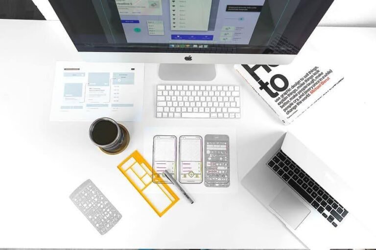
UI designing is crucial as it directly impacts how users interact & perceive digital products like websites & apps. Let’s understand this factor more in-depth.
When it comes to user interfaces, even a small tweak can change how people interact with your product. At Wokegenics, we were curious to see just how much impact design could have. So, we set up a simple yet revealing A/B test: two different UI designs, one winner, a case study with highlighted heatmaps and results that changed perspectives.

We tested two homepage designs for our workflow web app. Each had the same core content but different layouts and visual priorities.
Sample A was minimalist. It featured:
Sample B is more modern and visual. It had:
Both versions were shown to different groups of new users over a two-week window. We used Hotjar to track heatmaps and clicks, along with scroll depth data and session recordings.
Users who landed on Sample A saw a straightforward layout with no distractions. The main CTA was placed center screen with a short headline above it.
Heatmap Findings:
Click Behavior:
This version worked well for decisive users. However, others seemed unsure or disengaged due to the plainness. While the clarity helped some, it felt “too clean” to many users in interviews.
Sample B added more visual weight and interactivity. It featured icons, soft gradients, and secondary CTAs to guide hesitant users.
Heatmap Findings:
Click Behavior:
Overall, Sample B led to more exploration, more clicks, and longer visits. Users said it felt “alive” and helped them understand the product faster.

Here is a quick comparison of both designs:
Clearly, Sample B outperformed Sample A across all key engagement metrics. It is because it balanced clarity with personality. It guided users without overwhelming them. And most importantly, it gave them reasons to stay and explore.
UI is not just about looking good. It is about making people feel comfortable, curious, and confident. At Wokegenics, we believe in testing everything, even the obvious. This A/B test reminded us that thoughtful design is not decoration, it is direction.
Want to find out which version of your design works best? Let our product and design team help you figure it out. From testing to building, what actually clicks, we are here to scale that works. Reach out to Wokegenics today. Let us build something users want to stick with.
References:
https://vwo.com/blog/scroll-depth-tracking-what-why-and-how-of-monitoring-visitor-engagement/
https://userpilot.com/blog/heat-map-tools-saas/
https://contentsquare.com/guides/ab-testing/metrics/
https://www.hotjar.com/blog/how-to-use-hotjar-ab-tasty-integration/
https://giveitanudge.com/what-is-a-good-scroll-depth-benchmark/
https://www.youtube.com/watch?v=qCHlwHe0_Wo
https://www.hotjar.com/heatmap-analytics/
https://neilpatel.com/blog/heatmaps-for-digital-marketing/
https://agencyanalytics.com/kpi-definitions/scroll-depth
https://www.woopra.com/blog/scroll-depth